Lead Magnet CTA Do's and Don'ts to Boost Your Conversion Rates
Crafting an effective call-to-action (CTA) is a critical component in creating a successful lead magnet. Your lead magnet CTA can either make or break your conversion rates. You must put as much effort into designing your CTA for your freebies as you do for your paid products and services. After all, you want to attract the right customer to your list – someone who is ready to buy and needs your offers. A well-crafted CTA can entice your audience to take the desired action and opt-in for your lead magnet, while a poorly executed CTA can leave your efforts falling flat.
To help you maximize the effectiveness of your lead magnet CTAs, let's explore some important do's and don'ts.
Do: Clearly State the Benefit
Make it crystal to your audience what they’re going to get and what they will gain by taking action. Clearly communicate the benefit or value your lead magnet offers. Be specific and use action-oriented words that create a sense of urgency and motivate your audience to act. For example, instead of a generic “Download Now” button, consider using a more compelling CTA like “Get Your Free Marketing Strategy Guide” that highlights the specific benefit they will receive.
Don't: Use Vague Language
Avoid using vague or ambiguous language in your CTAs. Vague CTAs like “Learn More” or “Click Here” don't provide a clear expectation of what they will get, and as a result, may fail to generate high conversion rates.
Do: Create a Sense of Exclusivity
Everyone loves feeling special and getting exclusive access to valuable resources. Leverage this psychological factor in your CTAs by incorporating words like “Exclusive,” “Limited Time Offer,” or “Members Only.” This creates a sense of exclusivity and urgency, making your lead magnet more desirable.
Don't: Overwhelm with Multiple CTAs
While it's important to have a strong CTA, using multiple CTAs can confuse and overwhelm them. Stick to a single, focused CTA that directs their attention and guides them toward the desired action. Having a singular and clear CTA will improve your conversion rates.
Do: Make Your CTA Stand Out Visually
Design the download form in a way that makes them pay attention to it. Make your CTA stand out visually from the rest of your content. Use contrasting colors, bold typography, or attention-grabbing buttons to make it visually distinct and easily noticeable. Ensure that it's easily clickable on both desktop and mobile devices for a seamless user experience.
Don't: Neglect Mobile Responsiveness
It's essential to optimize your lead magnet CTAs for mobile users. With the increasing number of people accessing content on smartphones and tablets, having a mobile-responsive design is crucial. Test your CTAs across various devices and screen sizes to ensure they are easily clickable and user-friendly.
Do: Provide a Seamless Opt-In Process
Once your audience clicks on the CTA, it's vital to provide a seamless opt-in process. Minimize the number of form fields required, asking for only essential information. The easier and faster it is for users to provide their details, the more likely they'll complete the process.
Don't: Neglect Testing and Optimizing Your CTA
Never underestimate the power of testing and optimization. Continuously monitor and analyze the performance of your lead magnet CTAs. Test different variations such as button colors, wording, or placement to identify what resonates best with your audience. This approach will help you refine and improve your CTAs over time.
In conclusion, a well-crafted lead magnet CTA can significantly impact your conversion rates. By following these do's and don'ts, you'll be on your way to creating compelling CTAs that attract, engage, and convert your audience. Remember to clearly communicate the benefits, create a sense of exclusivity, and optimize for both desktop and mobile devices. Regular testing and optimization will ensure that your CTAs continue to deliver exceptional results.
List Building Resources
No clue what to say to your list?
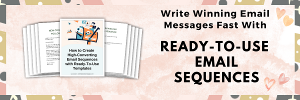
Write high-converting email messages faster and easier with Ready-To-Use Email Sequences
Do you need lead magnets to build your list?
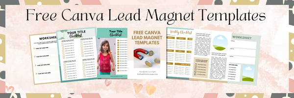
Get my free Canva Templates to easily create checklists, worksheets, to-do lists, and a variety of lead magnets to build your list.
Email Resources
- FREE Canva Checklist, Worksheet, and Lead Magnet Templates.
- Fill-in-the-blanks Canva Templates you can use to easily create Checklists, Worksheets, To-Do Lists, and Lead Magnets to build your list.
- Write Winning Email Messages Fast With Ready-To-Use Email Sequences.
- Want to learn how you can get more out of your email marketing? Head over to Email Marketing Beyond the Basics.
- My review of autoresponder/email automation services: GetResponse, Aweber, Kit, and MailChimp.
- Landing page builders: Leadpages – Landing Page Monkey.
Post Footer automatically generated by Add Post Footer Plugin for wordpress.


